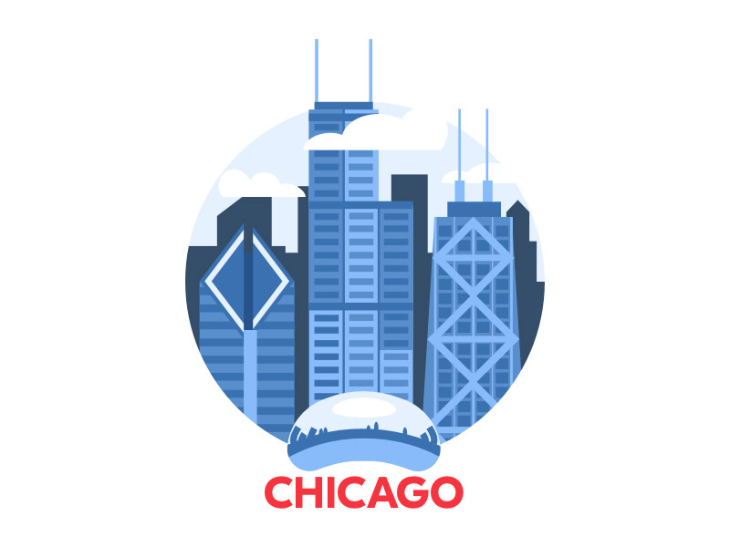
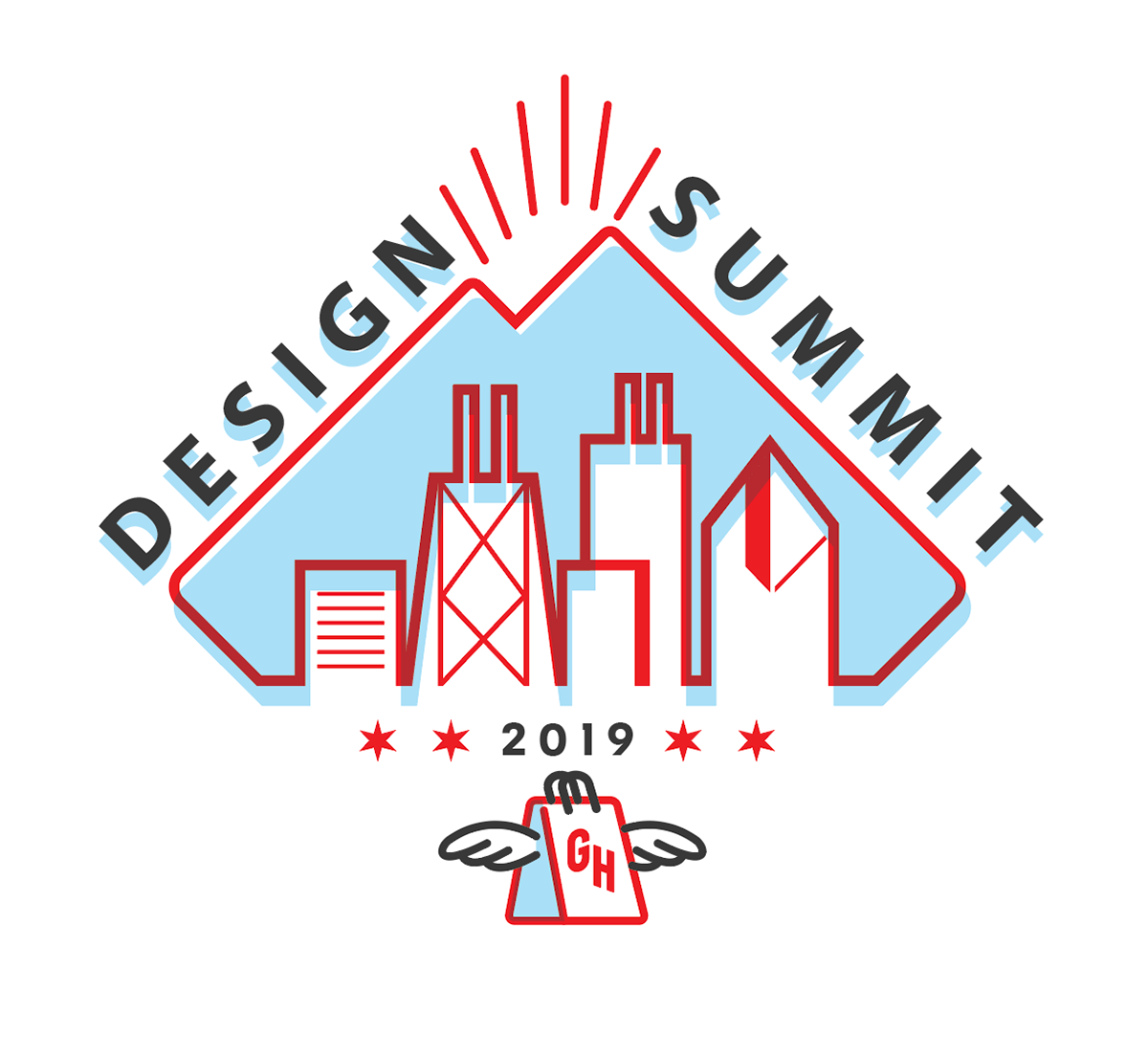
I was asked by the design team to create a logo that could change slightly year to year, as summit's would change to different locations. I had a few "sketches"
We ended up with the bottom right image as the final logo. I wanted to create this cool "offset/overprint" look with colors that were taken from the Chicago state flag.
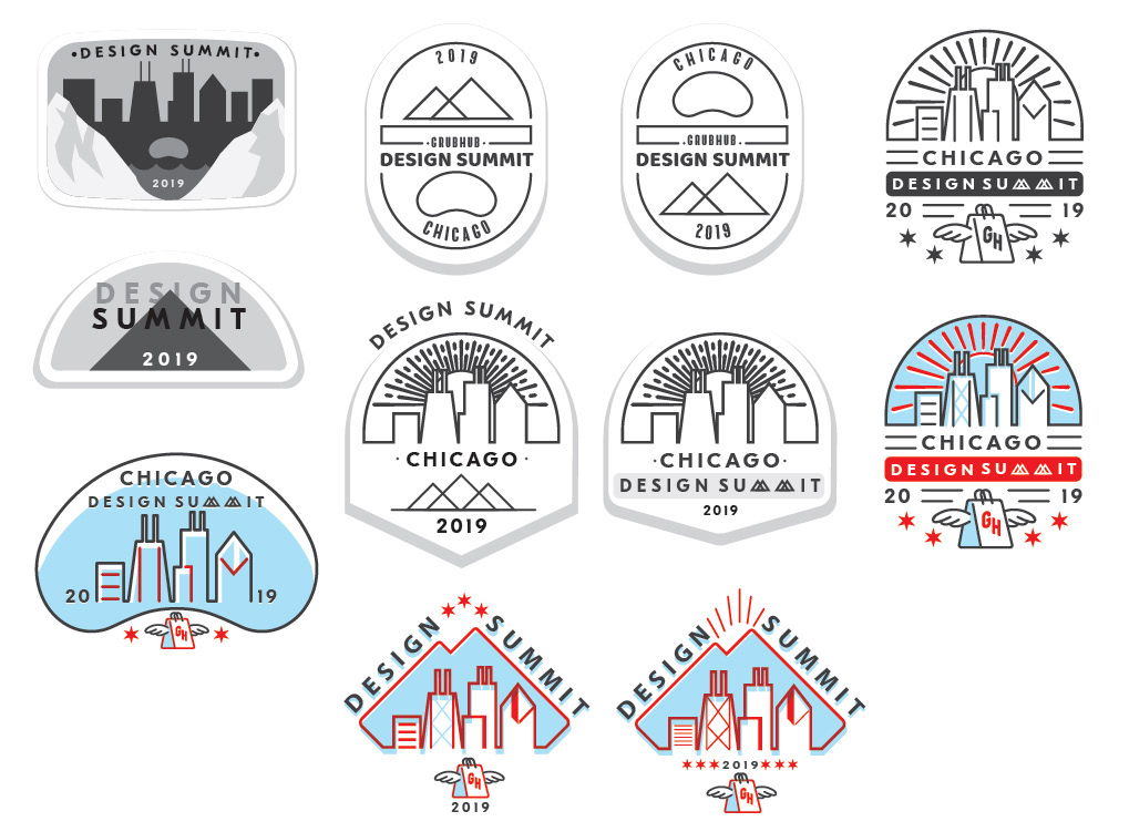
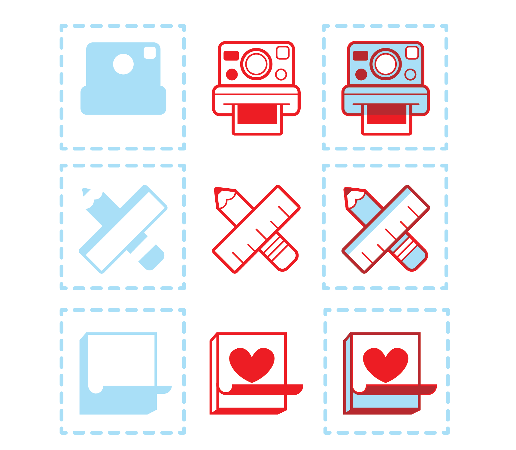
I was also asked to create some stamp designs as a part of an activity designers would do during the summit. The blue represents the image silhouette on a paper booklet designers were given, and the red represents the stamp. The last column represents the silhouette + stamp together and conceptualizes what it could look like once the designers used the stamps over the silhouette images.
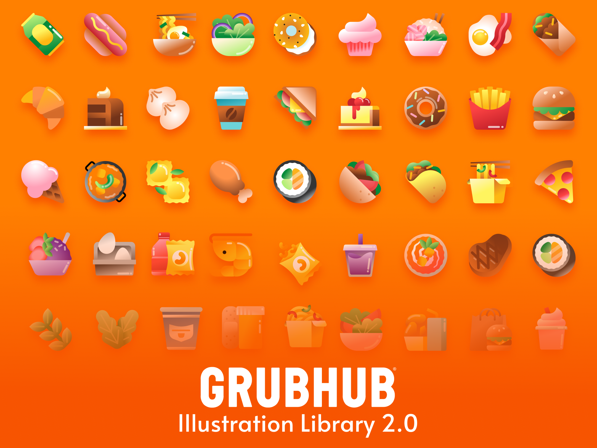
The end!