CONTEXT
Order Tracking icons were not consistent for both diner and driver apps and they were not as clear as we wanted them to be. It brought confusion to diners since it wasn’s clearly communicating which was home, driver, and restaurant. I was tasked to do a light update to make the icons more clear in communicating on what icon/pin represents what. While this was a simple request, I proposed we push the boundaries on a simple icon, and do something much more.
Tools: Blender3D, Figma, Illustrator
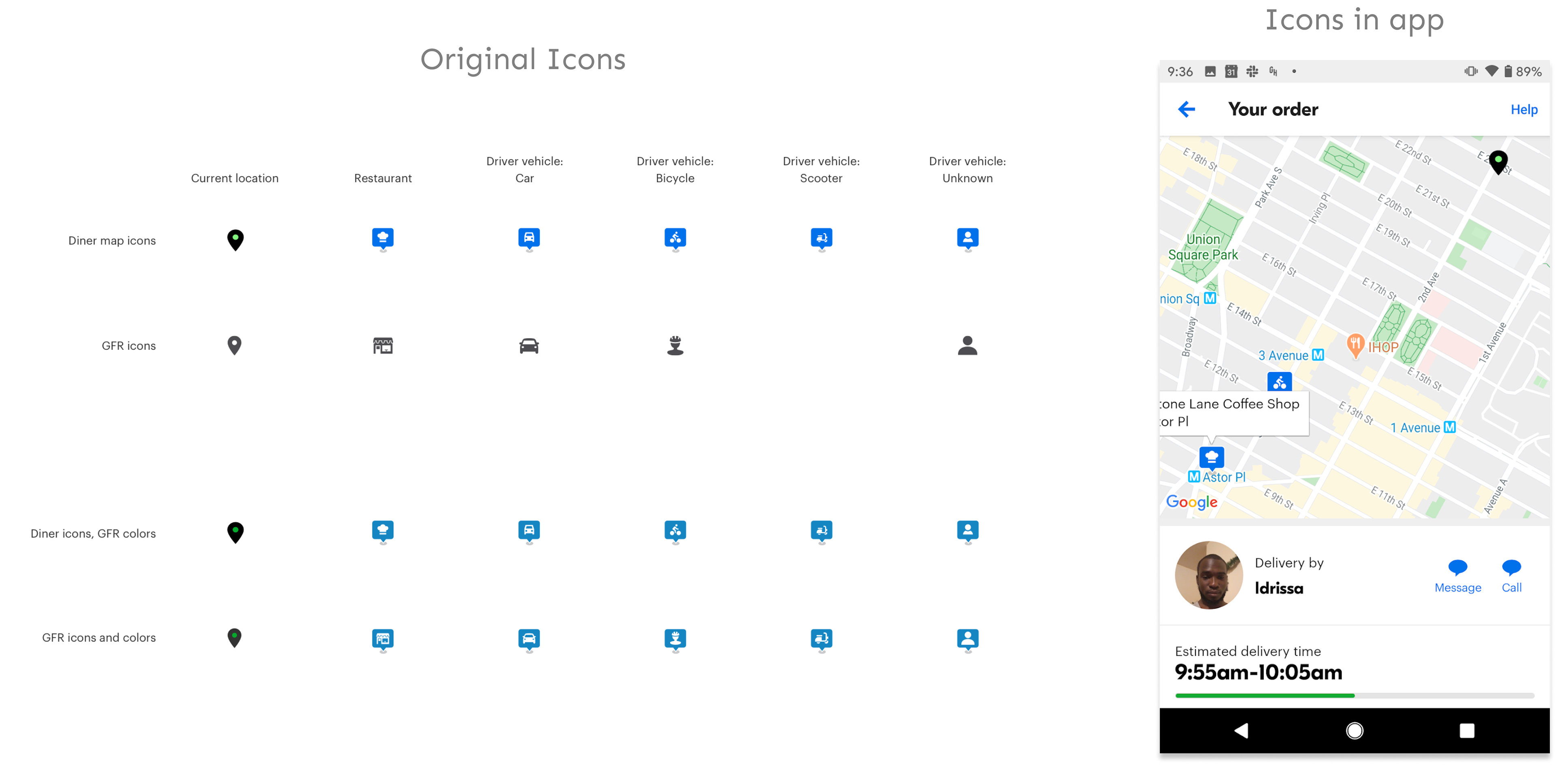
We started on a “low-level” exploration of icons just to get an update on the icons to replace our old ones and this is what we came up with initially.
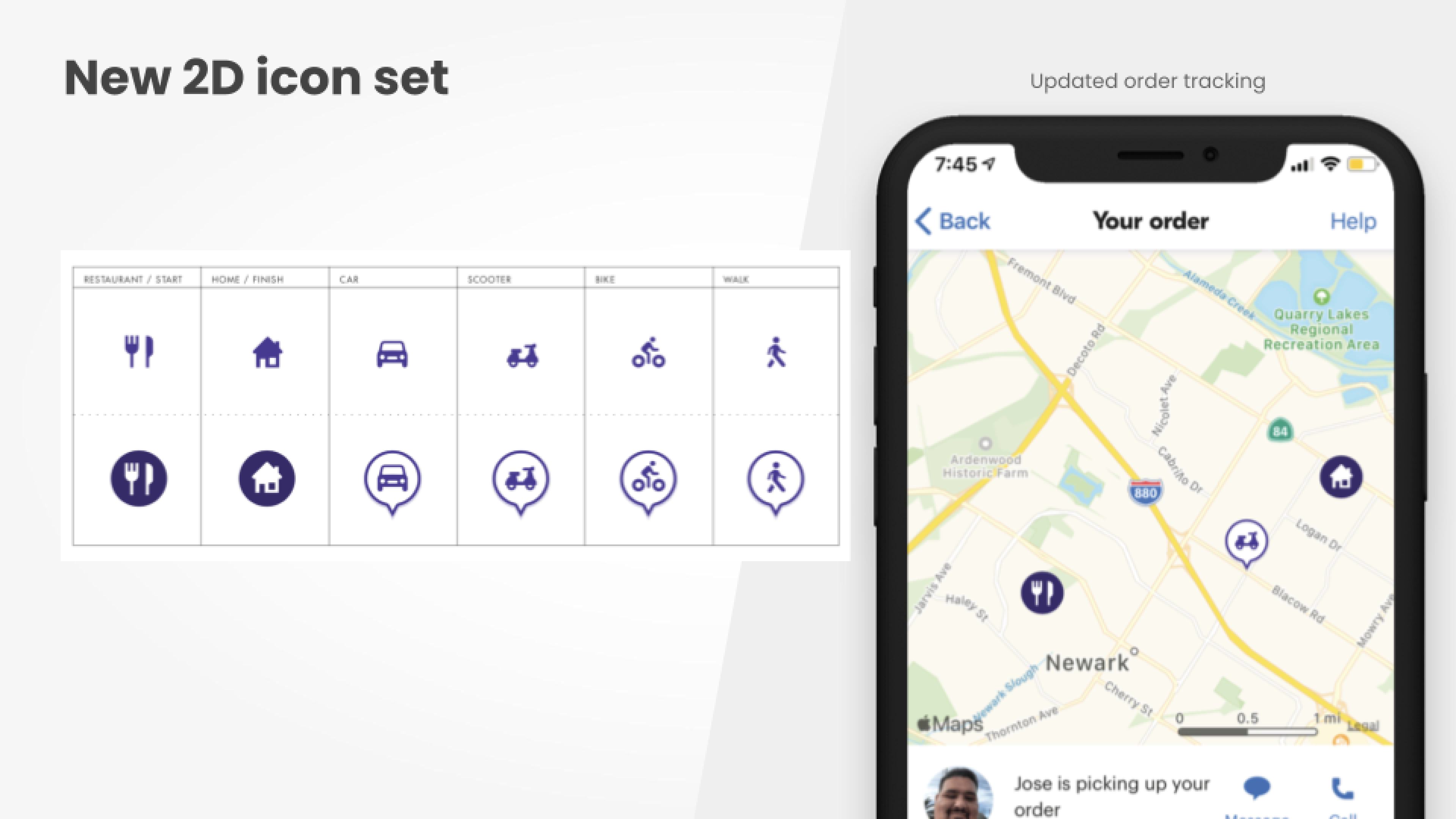
Cool! ...But could we make this a better experience?
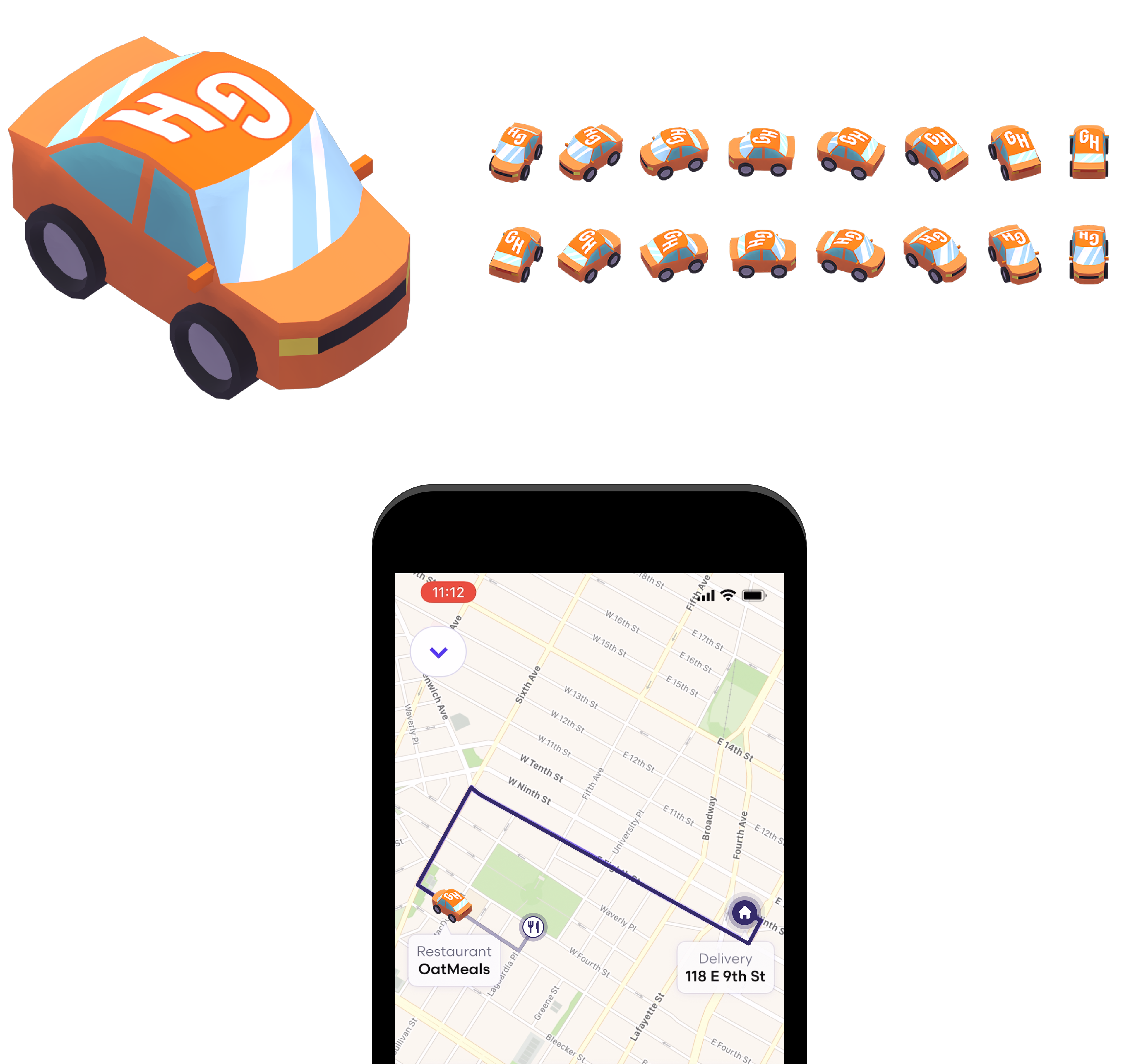
I knew that I wanted to do much more with this. This was the opportunity to do something delightful for our users and our brand so I started thinking deeper. I proposed doing 3D icons and worked with engineers to see if the possibility was there and it turned out it was very possible. So I got to work.
I started with some sketches but wanted to model the car based off of our car illustration in the illustration library. I modeled the car first so I can show and share partners that this was possible and to get people excited to see how it works in 3d. Needless to say people were very excited.
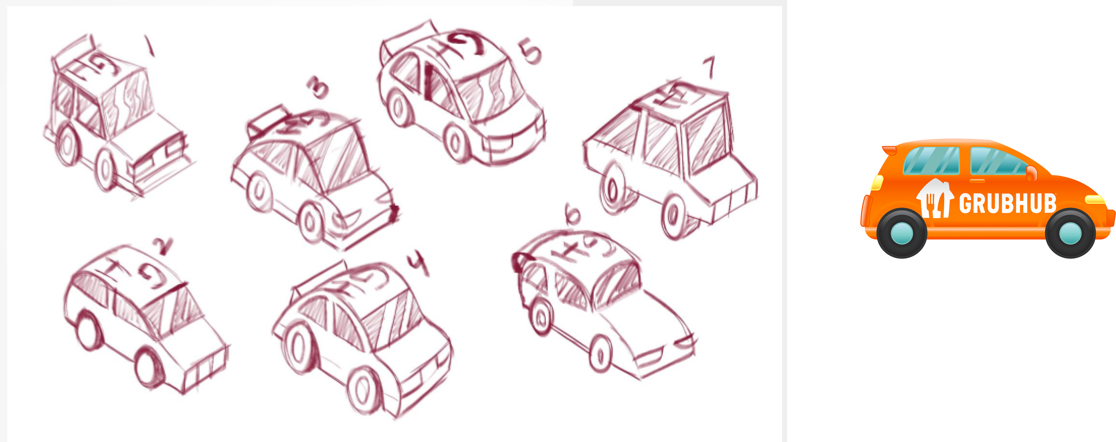
After tinkering with the 3D car to ensure the shape looks good in all directions along with the branding looking good as well this is the final 3D car
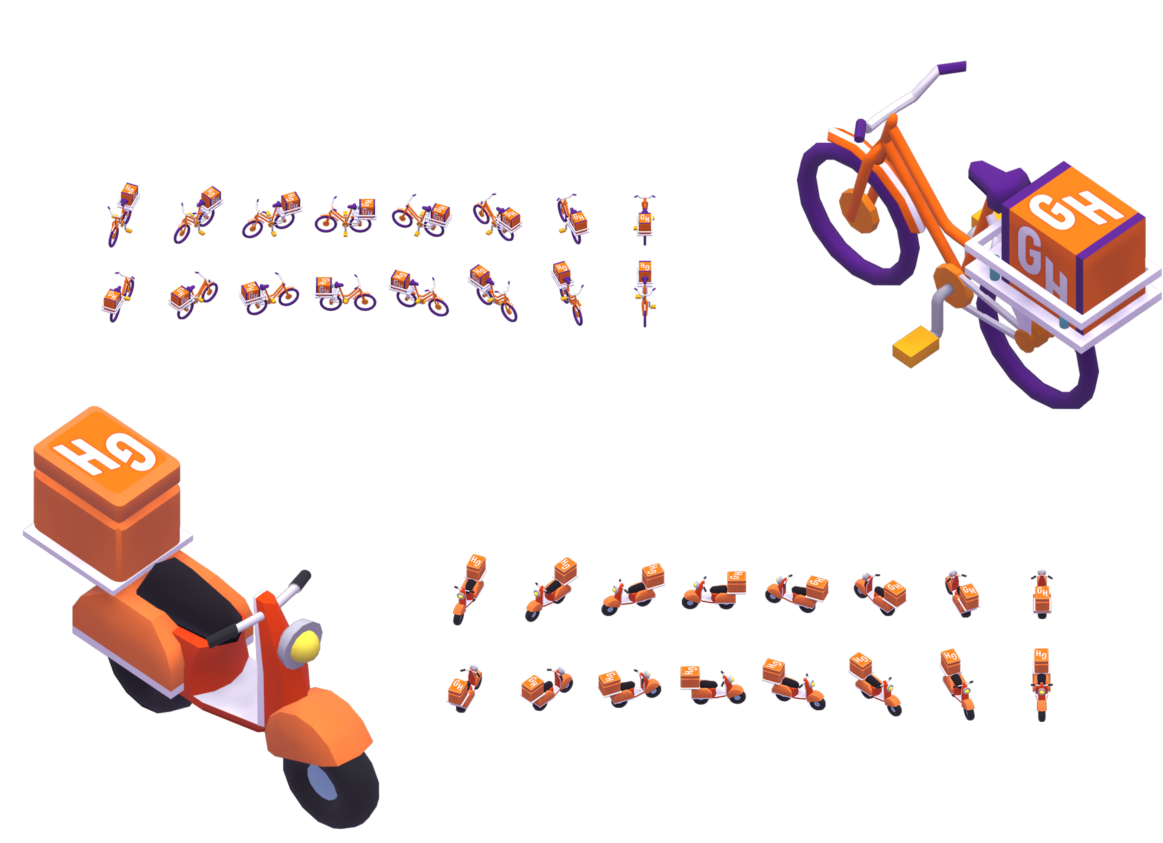
And naturally there was an ask to do a scooter and bike for those type of delivery drivers to be represented on the order tracking map and I created these branded versions