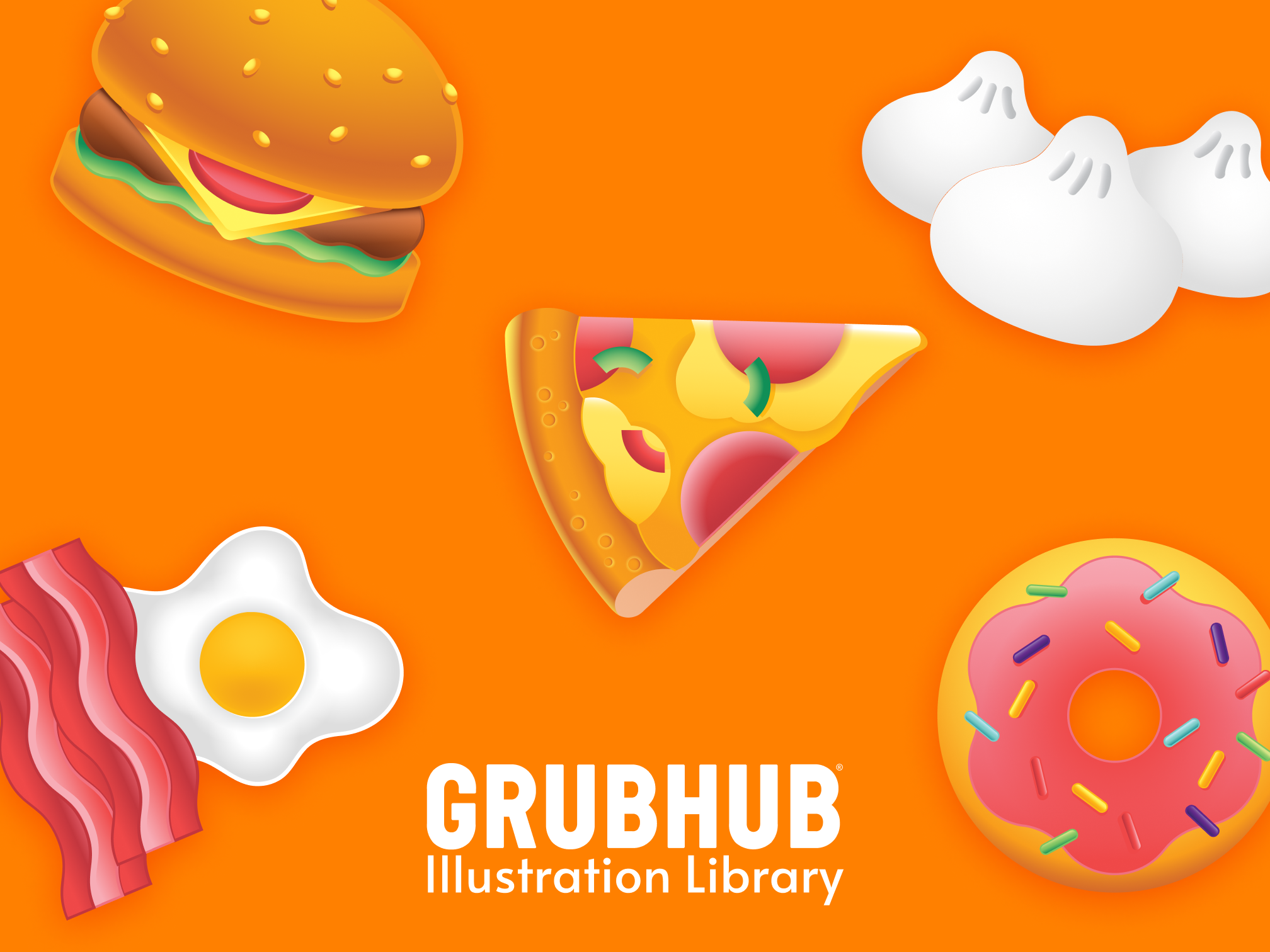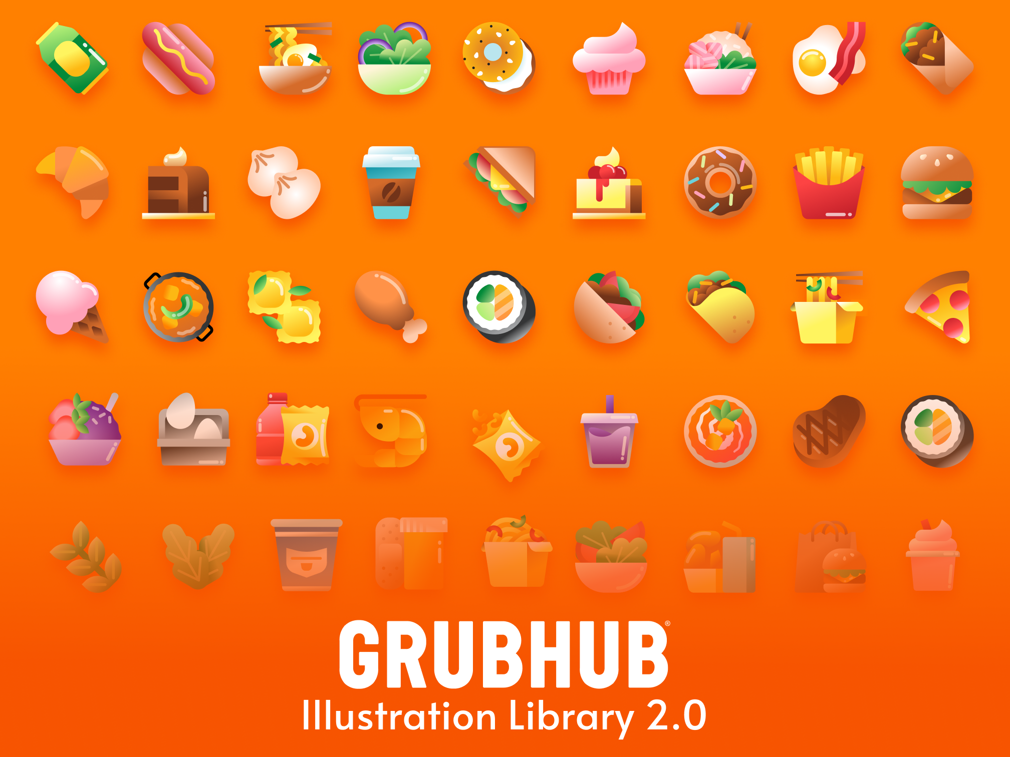
Overview
As the new style of illustrations started populating the app, there were still some elements that were using the old illustration style such as the fallback patterns where restaurants had no photos or empty states. They were using the old style and also didn’t fit with copy requirements. I created patterns and empty states and even created a specific color palette for zero/empty states.
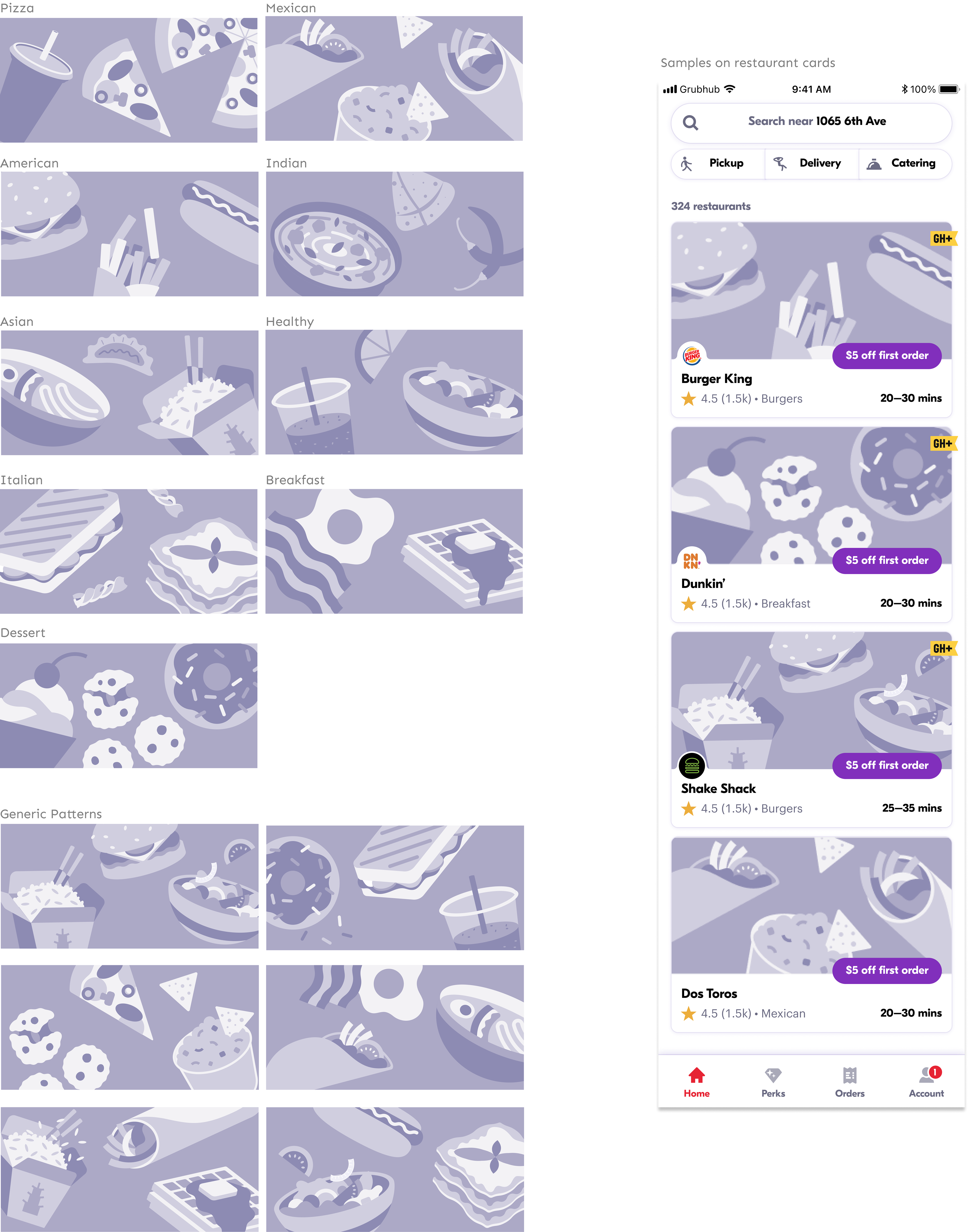
Fallback Pattern
Cuisine specific & Generic Fallback Pattern for restaurant cards
Our fallback patterns were old and reflected the old illustration style which no longer represented Grubhub, so it needed a major facelift.
Initially we wanted to start with one pattern to rule them all but we thought it would look much better if we could tailor the fallback images for top 9 cuisine and 1 generic. We ended up liking the generic one as well and decided to do more versions so that if there were many restaurant cards without photo images it would be pleasing to look at, here is the new set:
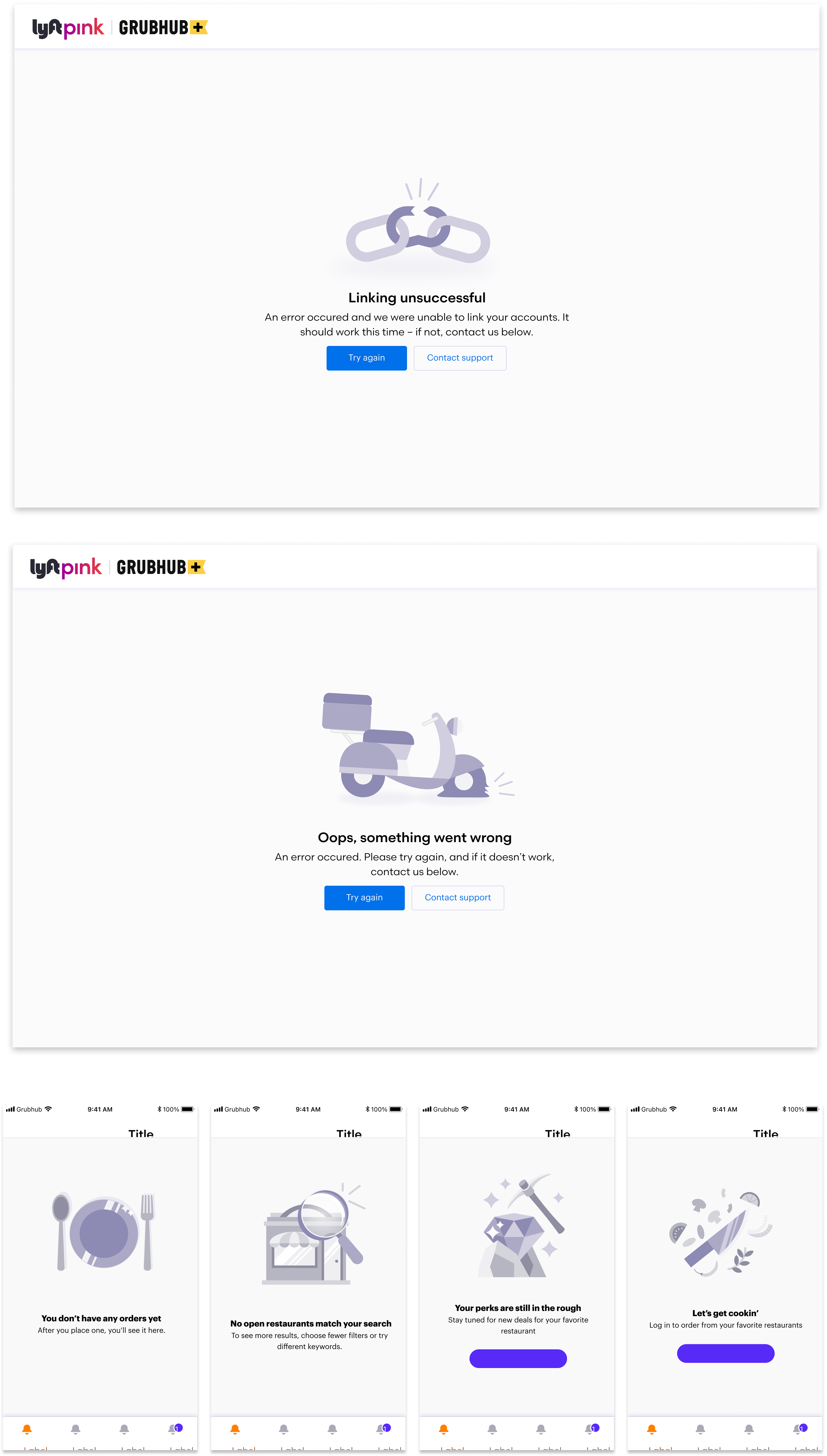
Zero / Empty States
Various Empty States for different purposes
Grubhub’s empty states were outdated with the old illustration style and we were looking to have more purposeful and metaphorical empty states that go with the copy. Our old ones were not in alignment and they were quite random.
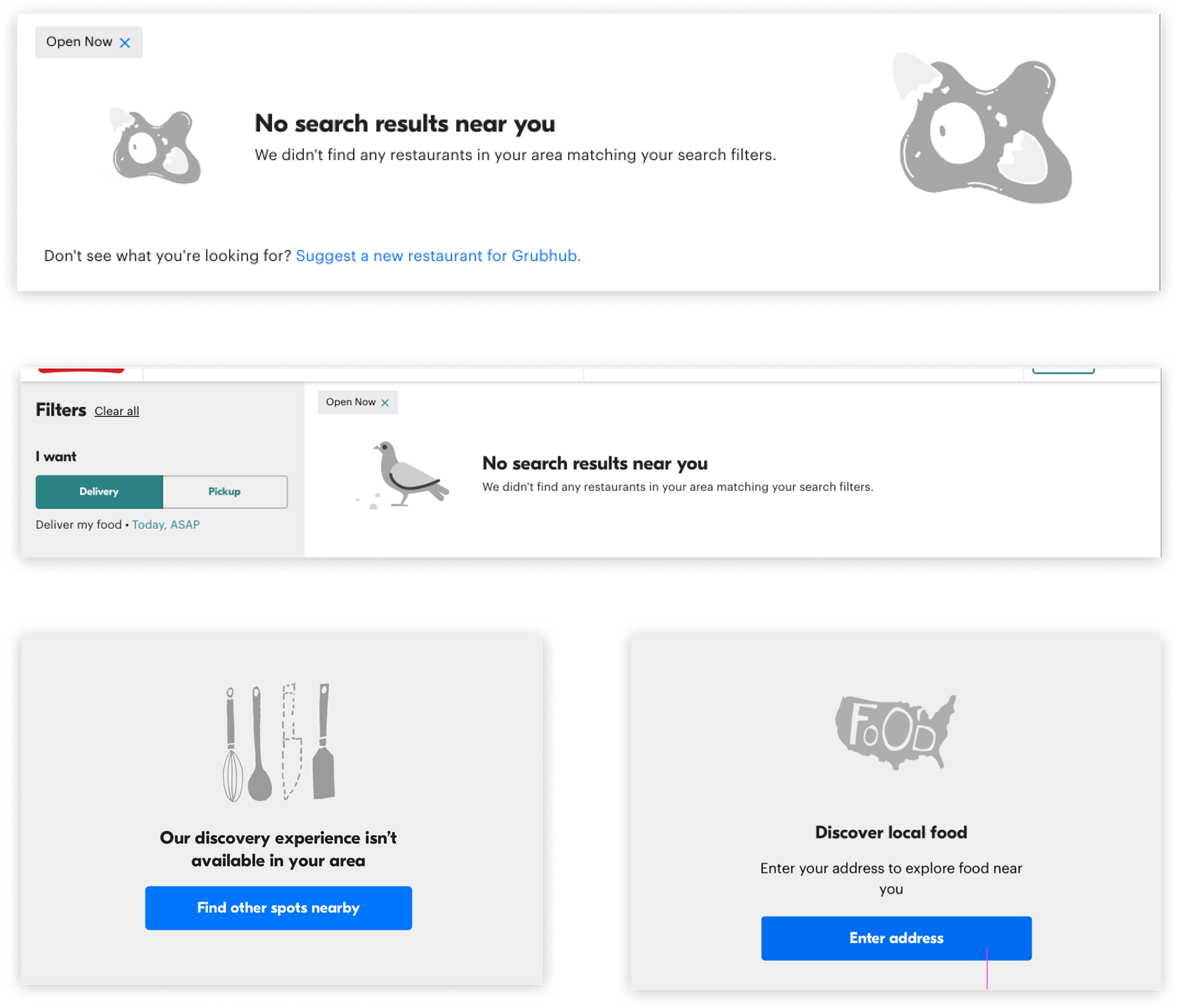
After a lot of experimentations with color palettes and the look we were seeking we came up with these versions for various messaging and many of them are usable as a generic illustration