Overview
After running the original cuisine illustrations on the cuisine ribbon on the homepage, we noticed that many of the illustrations were not as balanced as we wanted them to be. Some illustrations were much smaller in scale or overly detailed in a small space. I was approached to create something better so that users can read the illustrations better at a small scale. And this is how the new illustration style was born..!
Cuisine Ribbon Illustrations
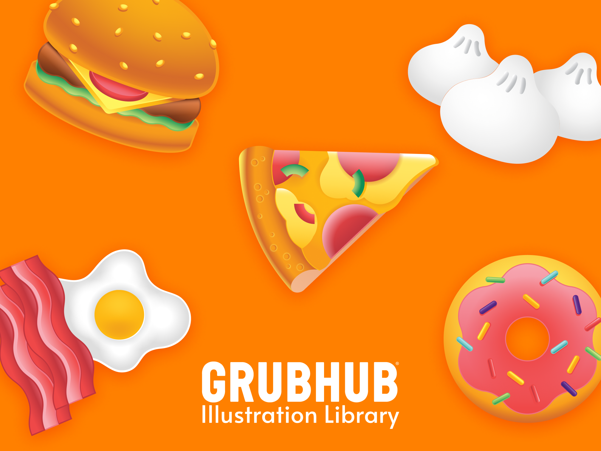
Small sized cuisine-specific & generic Illustrations
We had used illustrations 1.0 for the cuisine ribbon and although it did well to give users a visual selection of cuisine, where we didn't have it before, the style was not the best at small scale or in the app. Details were getting lost as these were originally designed for spot size (75x75) or more.
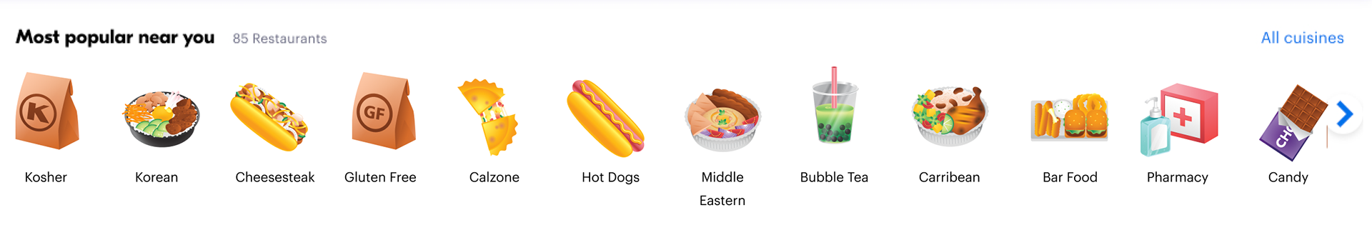
So I experimented with some different styles, streamlined the illustration color palette, and started with top 50 cuisine to test out and see how it felt and looked within the app. This is the style we ended up with due to it's simplicity and readability at small scale.
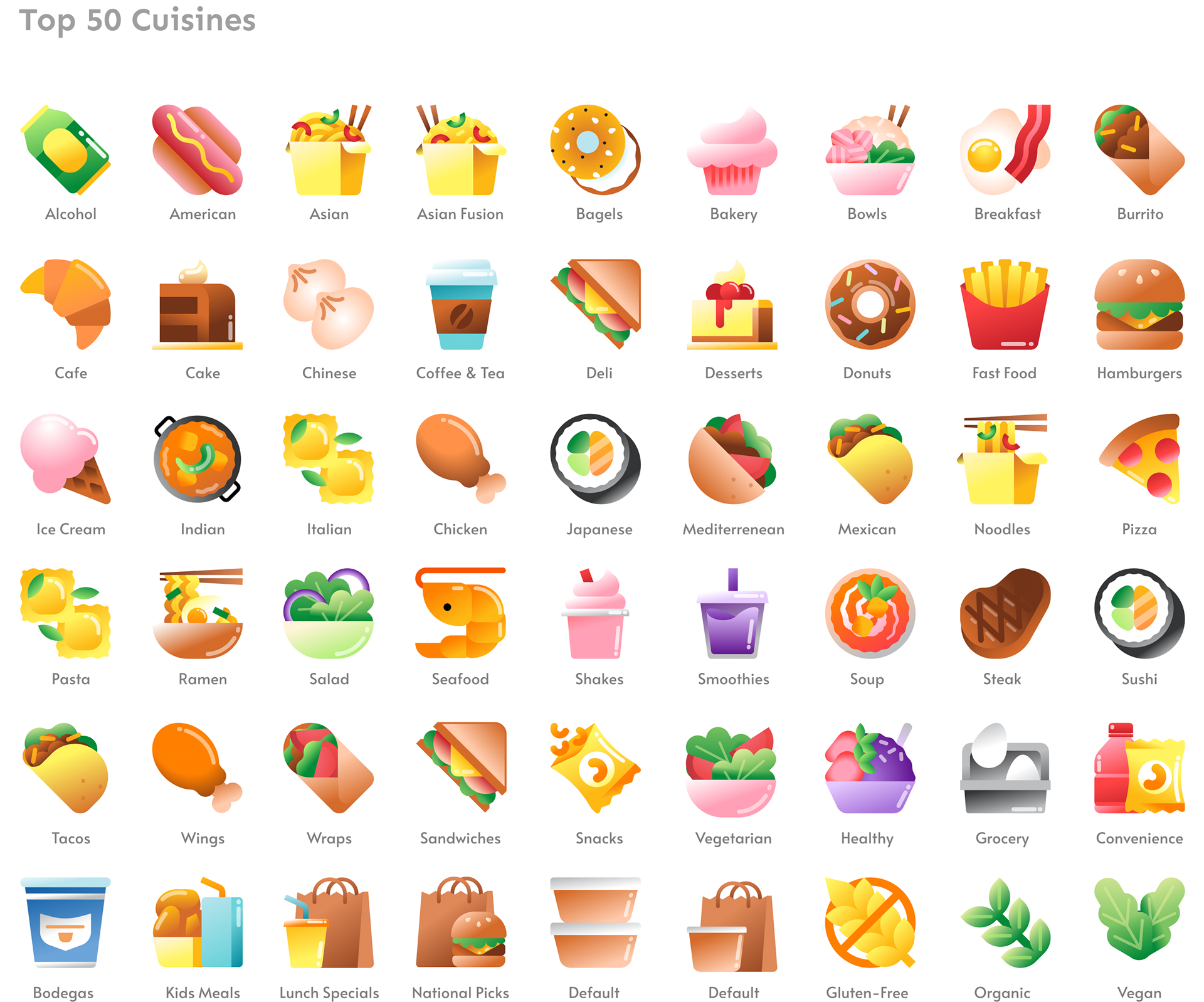
We ended up getting such a positive feedback on the overall style that we decided to attempt creating a new illustration library with this style, starting with small features and with it ending up growing quickly across teams. And thus, illustration library 2.0 was born.